No matter what your design needs are, I am currently taking on new projects and look forward to hearing from you. Please email or call me using the contact information below.

When I joined A Cloud Guru (ACG)in the summer of 2019, we were a small high-growth company. We had a highly successful community-first brand that had connected with a lot of people looking to learn about working in cloud technology.
The goal for the next two years would be to continue to grow and codify the ACG voice — and to leverage a human brand to capture enterprise clients without losing the spark that had connected with so many individual learners.
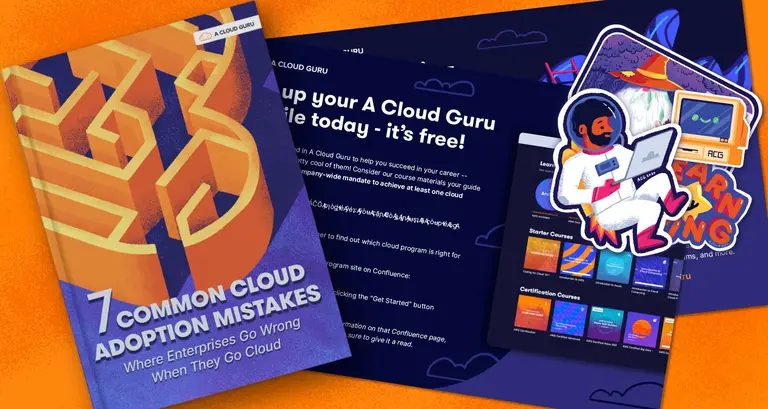
A Cloud Guru was built on a viral set of instructional videos that turned the co-founder into a celebrity in the cloudier corners of the internet. ACG found that having their instructors hand-make courses forged more personal connections between the learners and the instructors.
As we began to define the look and feel of the brand, finding a way to mimic that hands-on approach became a core pillar. It was important that every touchpoint needed to be a real human-to-human interaction. Shortly after coming on board, I led the charge to transition away from the techy “new-wave” style we had been using toward custom illustrations designed to stand out in a world of sharp vectors.
As part of ACG’s mission to teach the world to cloud involves encouraging people who may feel intimidated by technology to take the first step to learn new tech skills, warm, playful, inviting imagery served two purposes. Besides delighting learners, our hope was that it would make technical content feel less impenetrable and more approachable to newcomers.
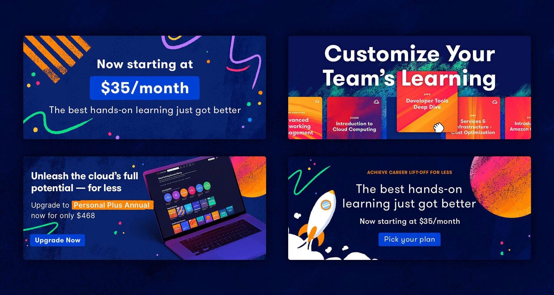
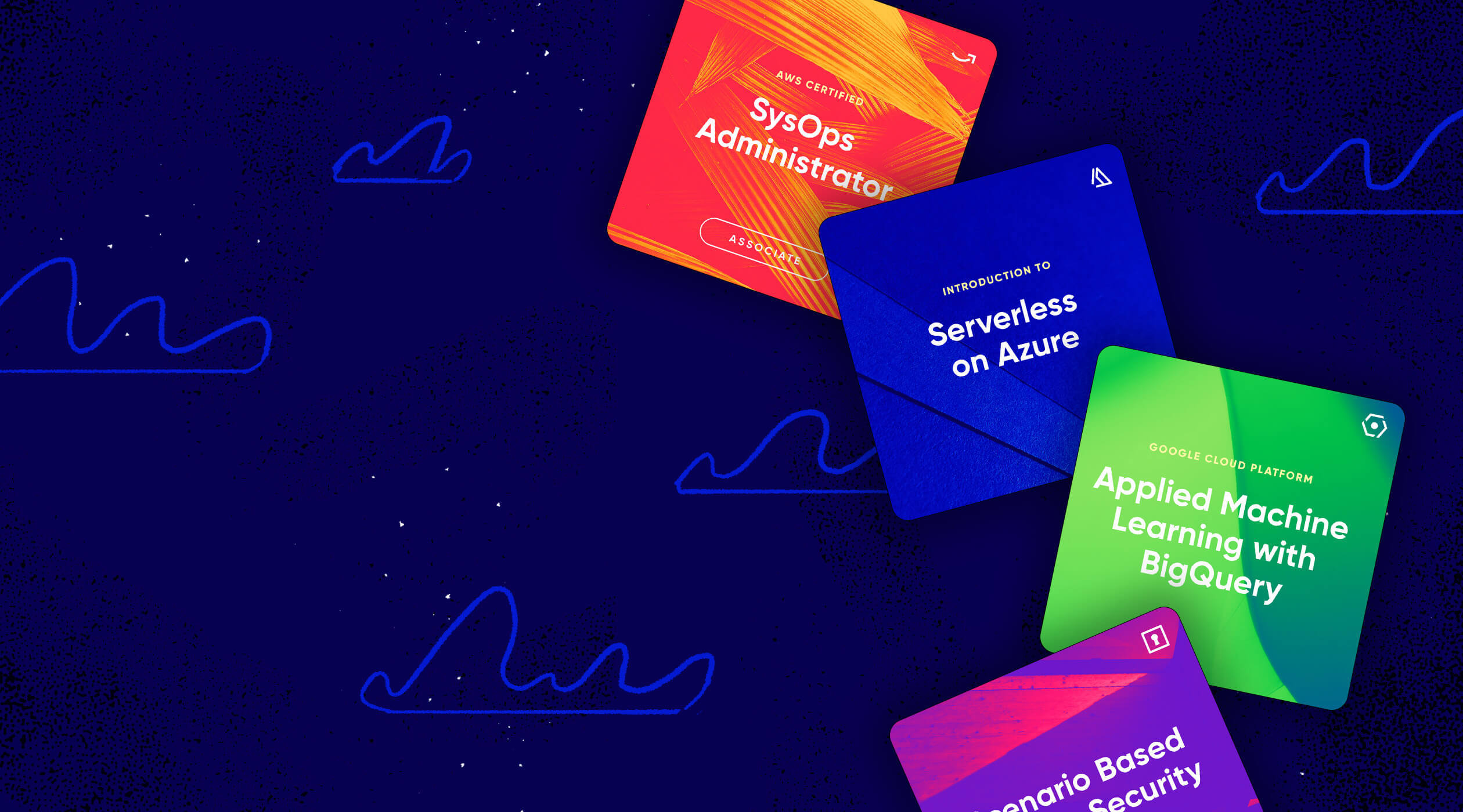
In early 2020, we acquired Linux Academy, our top competitor, and by summer we were ready to relaunch our combined platform. This included a new website and a refresh of our brand. One of the key components of the refresh were updated course covers.
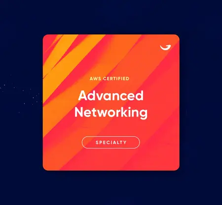
Our system for generating covers had become a little unclear over the early years of A Cloud Guru, so we set out to sharpen it up. Each cover would be broken up into three interchangeable parts:
1. The title with an optional strapline above the primary text that could be used to call out the platform.
2. A gradient for each cloud platform. (ie: AWS, Microsoft Azure, etc)
3. An icon for the skillset taught. (ie: security, devops, etc)
In addition, I built a Photoshop file with a few custom actions to speed up the process. After creating the primary cover, a designer runs the Photoshop Action to generate and export each asset needed across the platform.
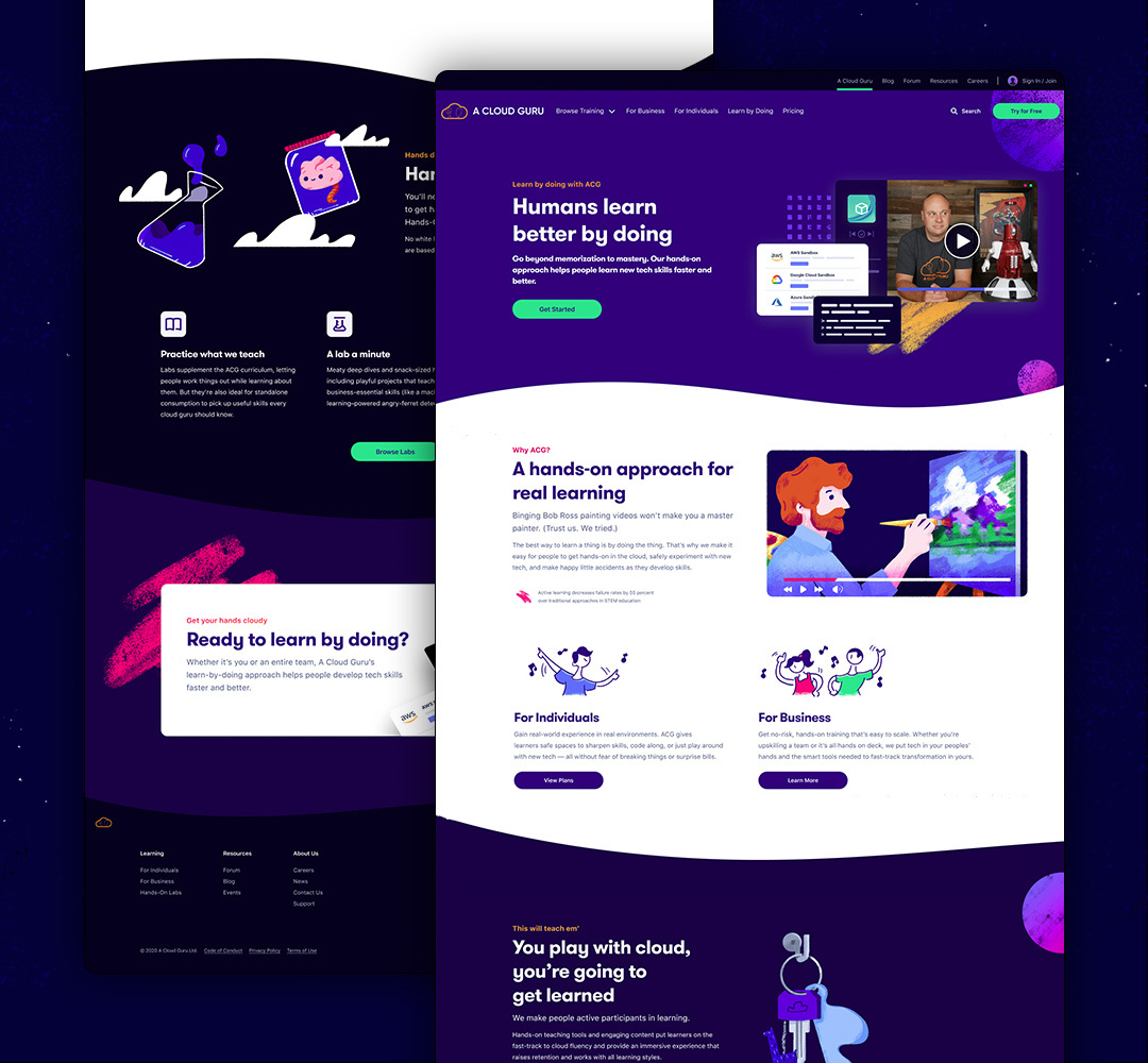
My role in the relaunch of the website was more focused. These pages came to me at the very end of the process, often already in development. There would typically be a space left open for an illustration near some copy. I would talk with the web designer and copywriters to understand what story they were trying to tell with each section and ensure I was pulling in the same direction as them. Then my piece would be dropped into the final designs.

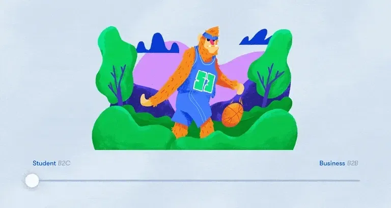
Sometimes the goal was to just inject a joke or a bit of levity with our bright colors and loose painted shapes. Other times we were focused on spotlighting a part of the product or a particular business problem. We built a sliding scale into the brand to move for our desired audience. For the more business-oriented audience, we leaned on mockups and UI elements. But for the community, we were able to maintain a playful sense that learning should always be fun. Each side of the brand still held parts of the other, but the emphasis was able to change.
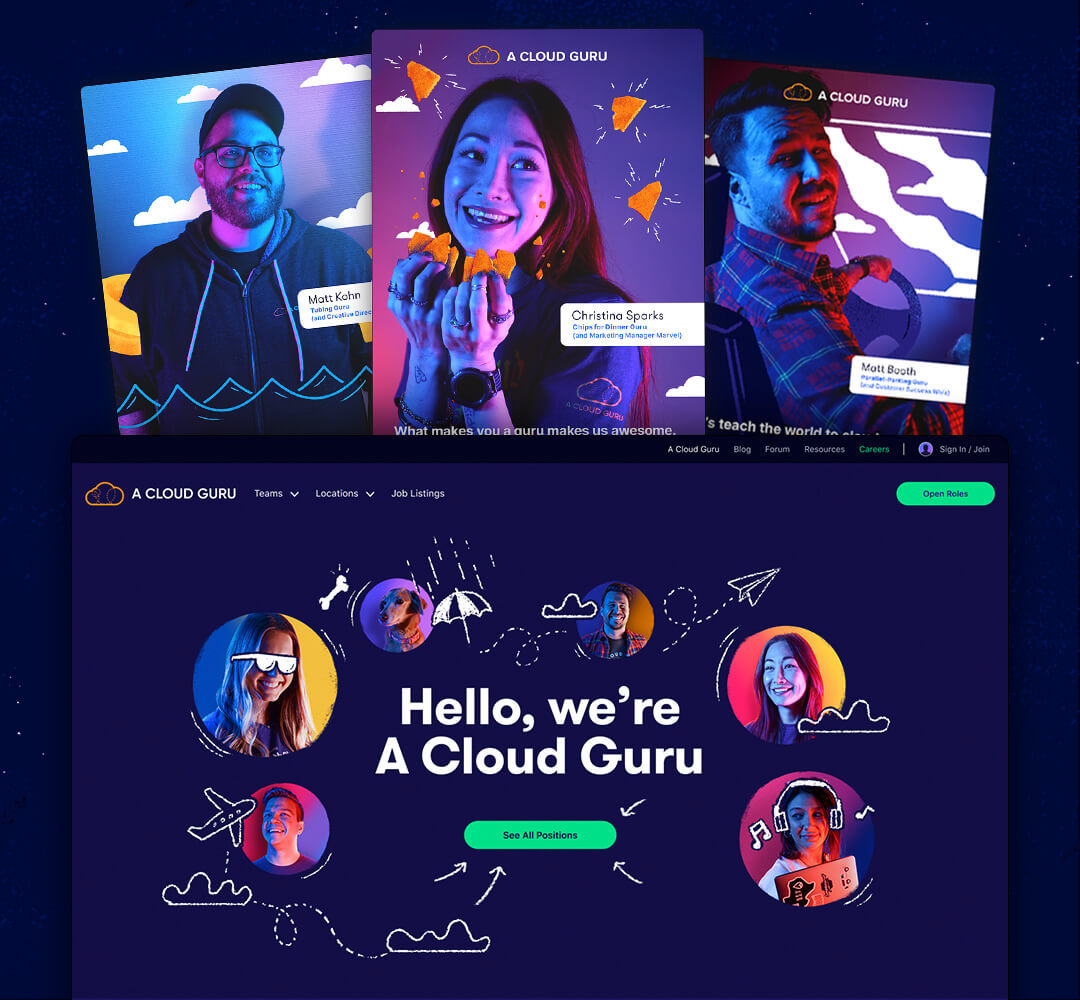
The careers section of the site was given its own unique twist on the brand to emphasize our company’s culture. Here the illustration style was focused on “notebook doodling” and drawing on top of photos of employees.
Any time we were recruiting, we would focus on a particular member of the team with doodles on them highlighting a thing that they were a “guru” of in their personal life. I loved that our company and team made knowing your coworkers and celebrating them a key part of who we were.
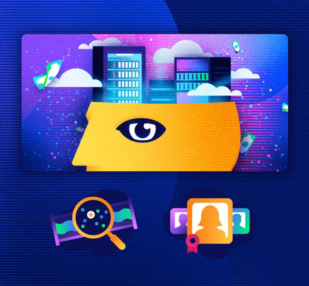
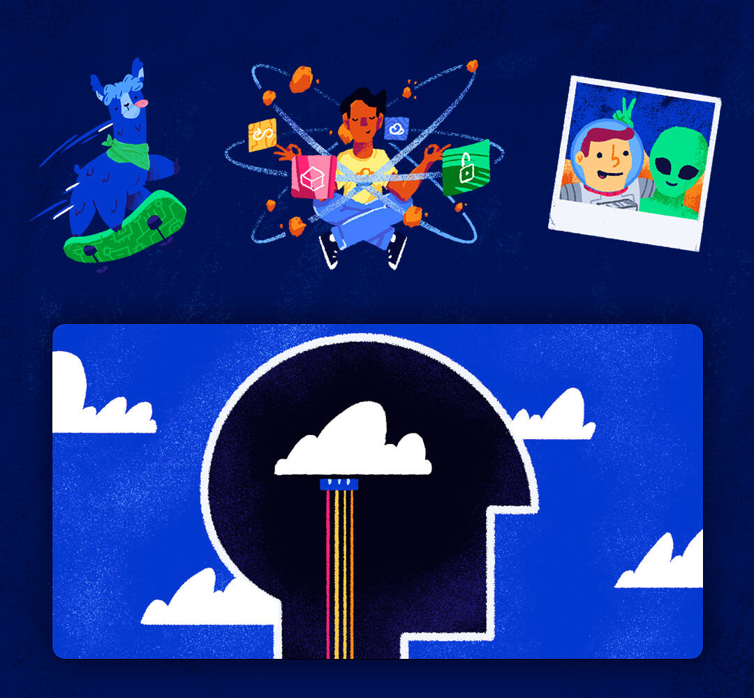
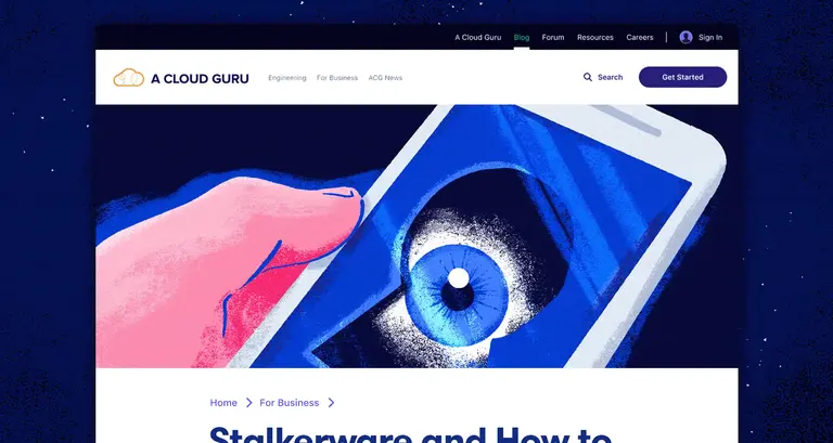
The blog was a place we could explore and express ourselves in more adventurous ways. This was often a place to find what was and was not working inside of our brand in a safer sandbox. As a result, some of my favorite ACG was for the blog. The blog’s authors and I would sync up to talk about what was in the post and have a jam session to come up with fun ways to communicate the story of the post. This eye-catching imagery would help the blog stand out from stuffier technical blogs populated with stock photography; it would also help drive engagement via social channels.
I also contributed to a series of animated videos. For these, a script would be handed off to me and the video team. Our group would then often loosely plan out the storyboards. After that, I would illustrate those storyboards, breaking apart elements so that they could easily be moved and manipulated by our awesome video team.
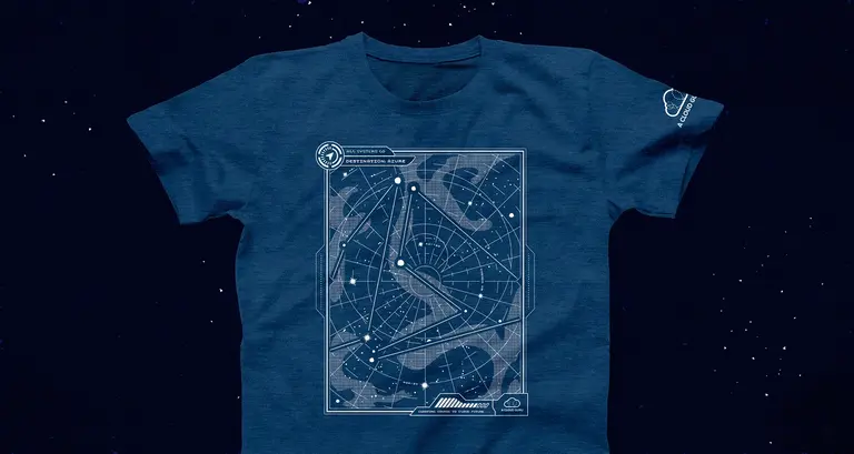
One way I loved getting to champion our customers was through swag. My approach to designing these first and foremost has always been to try and create something a person would actually want to wear. The goal of our company should never be to take a person wanting to celebrate our product and use them as a billboard.
Some examples of cool ideas I worked on:
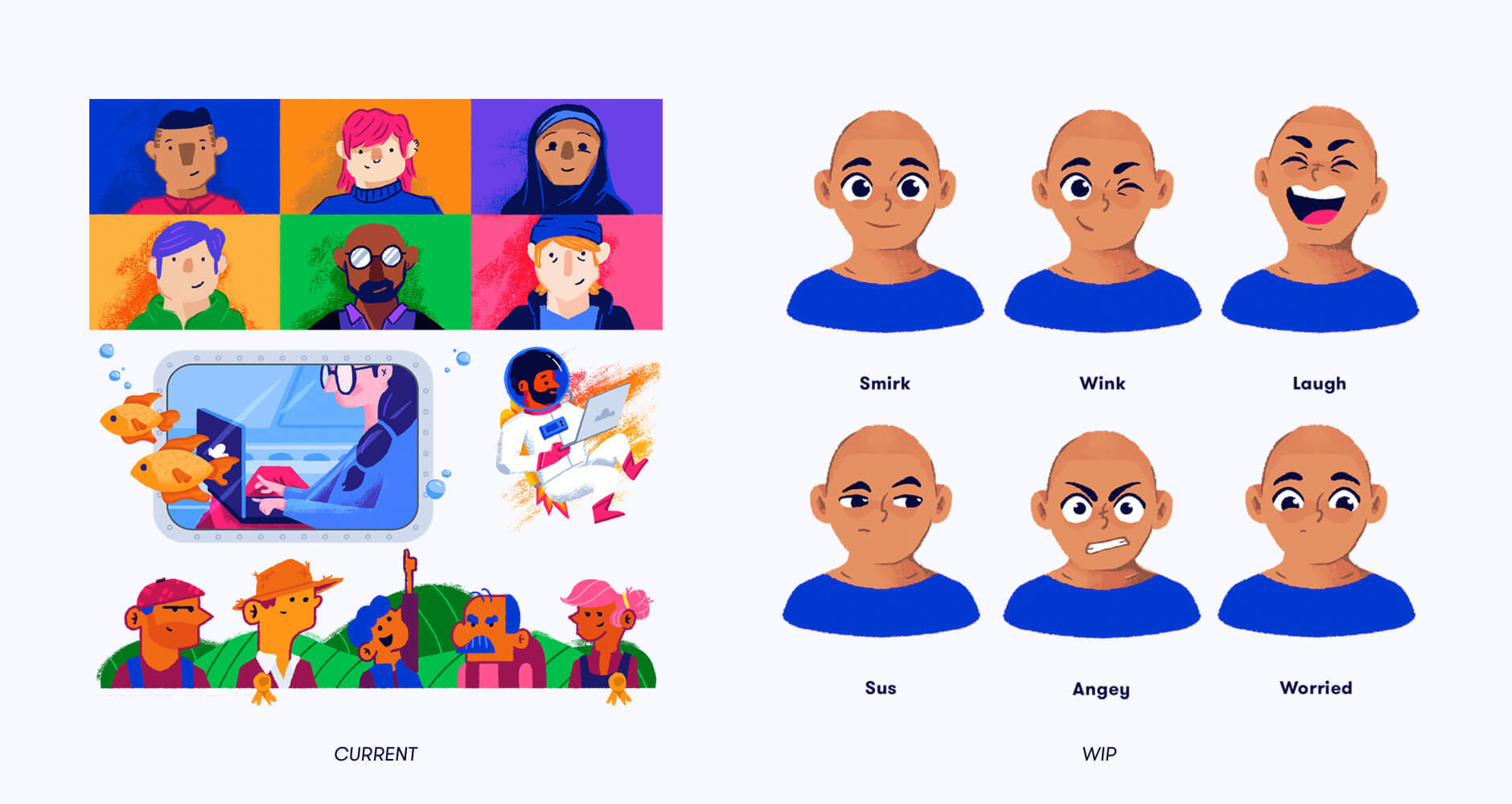
In the middle of 2021, we were acquired by Pluralsight. So many future plans for the brand have been put on hold. Two places that I had been working on for our illustration system were humans and the mascot.
I wanted to create a diverse “cast” with personalities and unique backgrounds. I envisioned that they would each relate to particular audience personas. The first of these characters I was working on was Alex (they/them), a person in their late 20s looking to pivot careers into the cloud.
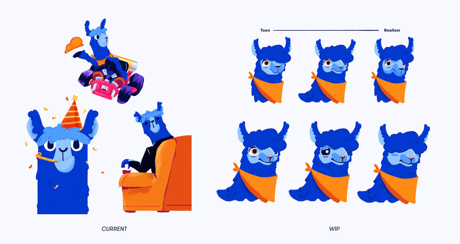
As for the mascot, we had just begun to search for a more finalized look to Mel the Llama, and what types of guidelines would be used. For example, should she be able to do human things, like ride a bicycle, or should she always be on four legs?
Being ever mindful of our roots, Mel’s name is a tribute to ACG’s early days. Our founders started the first office in Melbourne, Australia.
In my time at A Cloud Guru, I had the opportunity to work with some of the most amazing and talented people. We were able to establish a unique and vibrant look in a very crowded space — and we captured a huge audience. By the time we were acquired, we had managed to maintain our enthusiastic community while massively expanding into enterprise-level customers.
Special thanks to the amazing creative team that put this work together: Matt Kohn (Creative Director), Matt McDougal (Sr Copywriter), Eric Pulsifer (Copywriter), Katie Price (Project Manager), Bryon Stuefer (Product Designer), Kirrie Rodgers (Designer), Becky Plante (Designer), Lindsay Womack (Designer), Skyler Rogers (Copywriter), Julia Eagleberg (Designer), Evan Wright (Motion Graphics) & Jacob Branch (Video Lead)

Whether you have a big project or just want to say hello - hit that button below to shout my way. I would love to meet you and hear about what your team is working on!