No matter what your design needs are, I am currently taking on new projects and look forward to hearing from you. Please email or call me using the contact information below.

The Legend of Anura was a project designed as a love letter to my favorite games. I created a project that challenged me in the areas of illustration and web design, in an industry that I truly love.
This project has a lighthearted and adventurous illustration style in the same vein of classic Super Nintendo games. It was important that it not just be nostalgic, but also up to modern standards.
For the logo, the primary inspiration came about after studying game studio logos from the late 80s and early 90s. There were two primary types of approaches, a simple stylized word mark or an interesting geometric shape. After a series of rough sketches I was able to narrow it down to a final interesting mark.

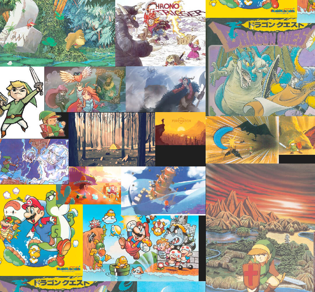
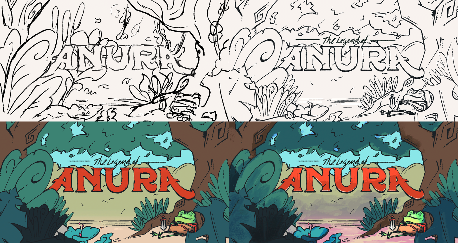
Next I set out to define the look and feel of Fira’s premier game, Anura. This process started with a moodboard. I collected illustrations from some classic games, and then set out to define a style and a narrative with a piece of key art.
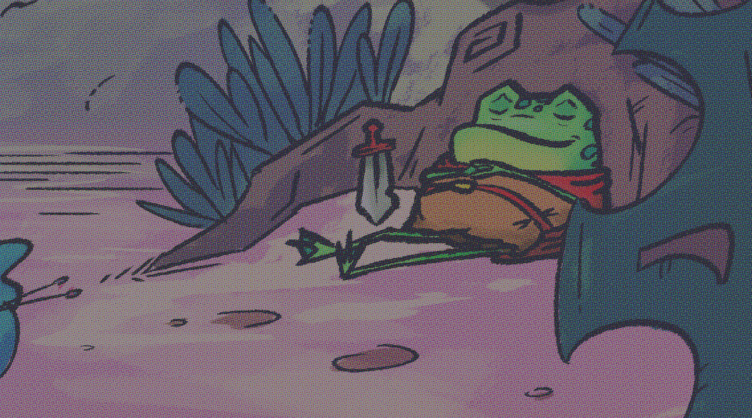
The hero is designed to have a whimsical quality, and the setting is squarely between fairy tale and classic children's fantasy. The scene I settled on was a quiet scene in the forest with the hero taking a nap before his big adventure.

Once the key art was in order, I dove in on the website. This entailed a site-map, wireframes, then a rough comp. All the while I used a small pool of gamers as my sounding board. It was important for this project to not just be seen by me, but also be seen by the target audience.
The Anura Page went through the most iterations, as I wanted it to have a lot of life. One version was even one continuous illustration. For logistical reasons I moved toward a more standard presentation of information, in order to allow for the screenshots to shine.

These pages were coded to be completely responsive. Currently only the Anura page is complete, but the rest of the site should be finished in the coming weeks.

Whether you have a big project or just want to say hello - hit that button below to shout my way. I would love to meet you and hear about what your team is working on!